Creative practices found within the co-design principle have been significant to much of Lab4Living’s work. Often this develops into informed kits that communicate complex research findings, such as the Serious Investigations kit that sought to guide patients and families in serious incidents investigations in the NHS, and the Life Cafe kit that facilitates difficult conversations around end-of-life care.
Lab4Living’s creative research assistants have developed a ‘Co-Design Kit’ to facilitate co-design in the ORIGIN project, where the research assistants, various project partners and young people will be designing an online arts and culture intervention aimed at reducing anxiety and depression.
ORIGIN is a multidisciplinary project that’s developing an online arts and culture interventional tool to support underrepresented young people with their mental health. It builds upon the O-ACE project, where a promising online cultural experience platform called ‘Ways of Being’ indicated great benefit to the mental health of young people.
Lab4Living, led by Dr Joe Langley, is facilitating the co-design aspects of the project, and involves recruiting young people to identify relevant content in archives and museums across the country to build the second iteration of the Ways of Being platform.
Not only will the ORIGIN Co-Design Kit be used to facilitate co-design, developing the kit itself used co-design practices. Here’s a step-by-step break down, taking you through the various processes behind the conception of the ORIGIN Co-Design Kit.
Research & Ideation
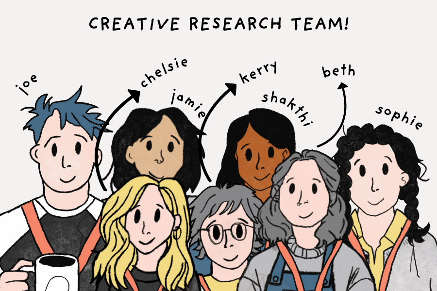
Our team of Creative Research Assistants have a diverse skill background: archival research, creative writing, film and TV, history, narratology, performance arts, to name a few. To fill in the gap in co-design knowledge, Dr Joe Langley led a workshop featuring previous co-design kits he had worked on. Seeing what the finished product could look like through these examples helped the research assistants understand and envisage what to include in the ORIGIN Co-Design Kit.
Over a few discussions, the researchers decided on these kit components:
- An Introduction to the ORIGIN: Ways of Being project and explaining the use of the co-design kit
- A Research Guide with instructions on finding hidden stories as per the project framework and ethical researching
- A Troubleshooting Chart to help identify and solve problems that crop up
- A Booklet (later called the Field Guide) that complies with archive visit rules that can be brought into archive spaces to take notes in
- A Digital Map (later called the Map of Archives) cataloguing all the archives in the UK with instructions on accessing them
- A Stack of Cards (later called Discussion Cards) to prompt discussion around the hidden stories behind the archival object they find
- A Set of Dice (later called Story Dice) with icons that’ll suggest next steps on developing a story
- A Guide on searching an archive or museum
- A Provocation Item (later called ‘Into the Archive’ object) to help think about the kinds of items with hidden stories that might be found
- A Badge to give the user the feeling of belonging to a group
- A Tote Bag with ORIGIN branding/art to bring into the archives and/or to provide a sense of professionalism to the project.
Prototyping & Testing
With the knowledge they’d recently learnt about co-design kits, the research assistants developed the first prototype of the kit over the next two weeks.
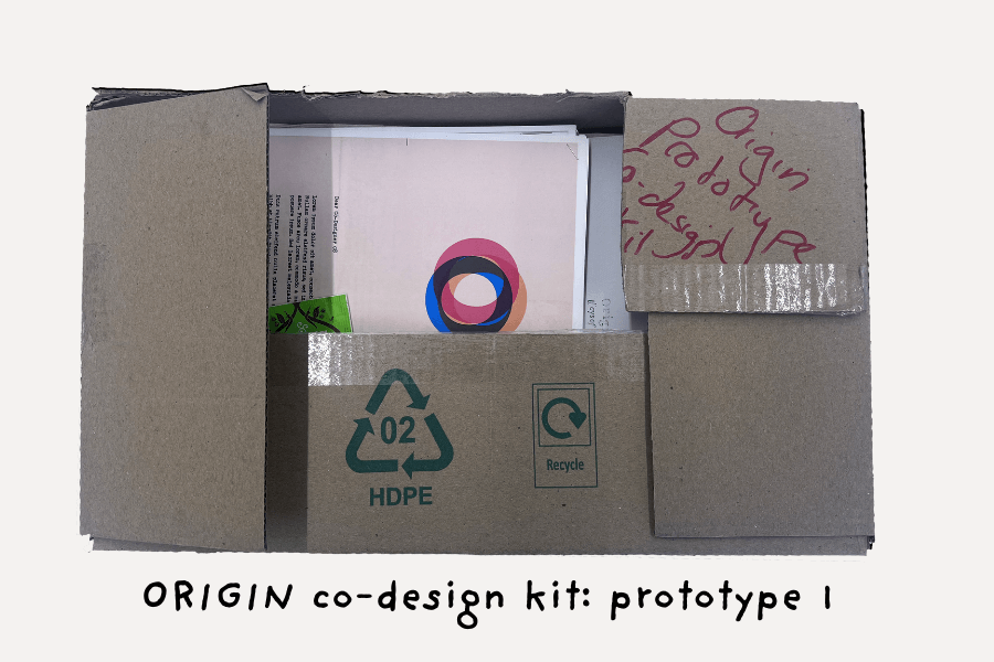
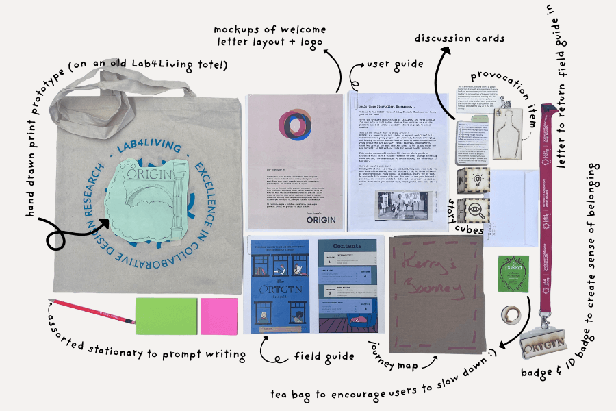
As it can be seen in the contents of prototype 1, a few of these elements came to fruition a lot quicker than others and were in various stages of completion.
Elements like the tea bag, stationary and return envelope didn’t require designing and only needed to be sourced.
Other elements like the Story Dice, Into the Archive object, Badge & ID card were relatively simple to design; the graphics were either licensed illustrations sourced online or designed on Adobe Illustrator and then created into patterns to be laser cut on softwares like CorelDRAW and LightBurn. In terms of the Tote Bag, the cost of producing a single tote to test the prototype was costly, so an artwork sketch secured onto a Lab4Living tote was sufficient at the time.
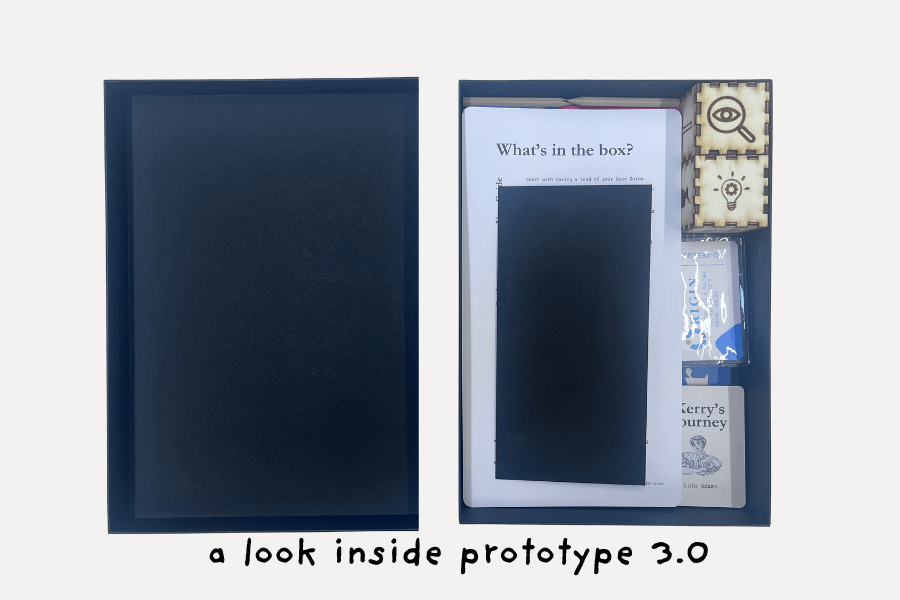
Hardest of all were the elements that required written content in them since they needed to be written, proofread and edited before printing. Since they contained instructions as well, they needed to be ‘tested out’, in which case a research assistant will follow the instructions to see if they are coherent. Elements like the User Guide (a document containing the research guide, searching an archive guide, QR code to the Map of Archives, instructions to return story ideas and troubleshooting chart), Discussion Cards, Field Guide were unfinished at this time but were printed off nevertheless just to get a feel and look of its part in the Co-Design Kit.
At this point, the assistants decided to add the ‘Journey Book’ to the kit, a resource with two examples of their personal process of finding a story.
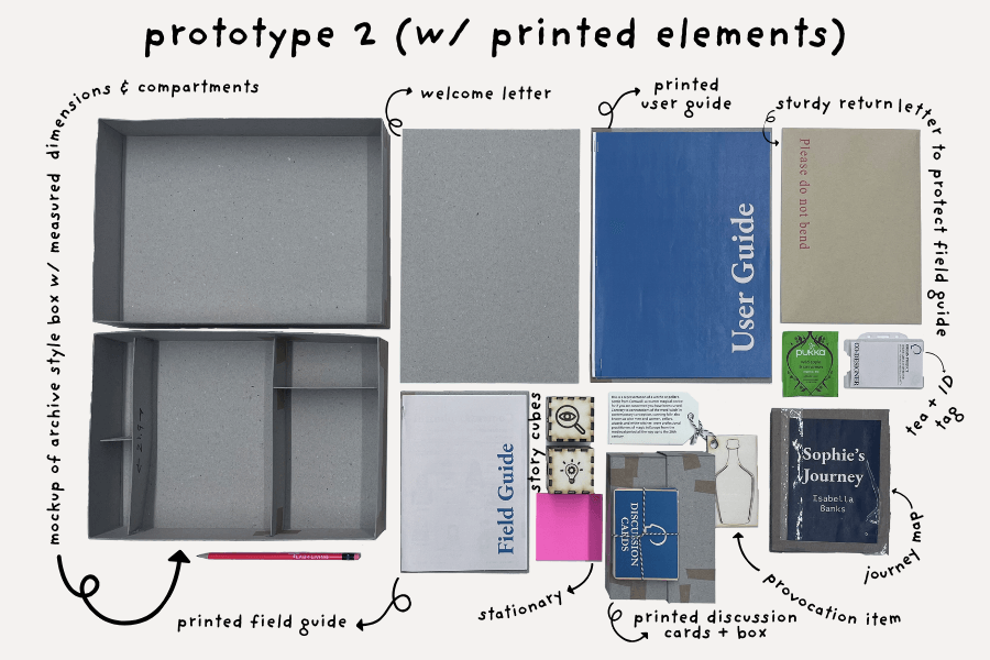
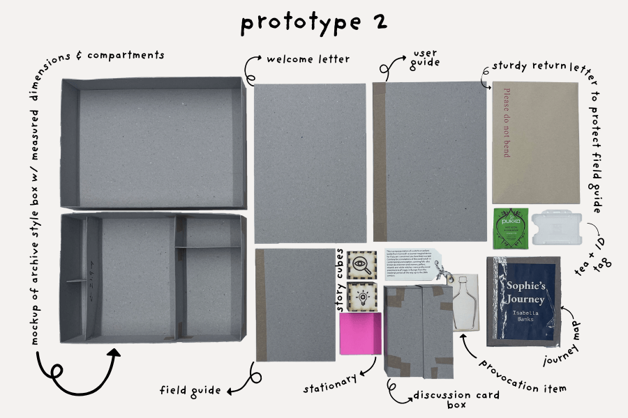
Prototype 2 was developed in response to the feedback raised during the first prototype, as well as with considerations of dimensions. A few elements largely remained the same, including the Into the Archive object, Story Dice, stationery and tea bag. By this time the contents of the User Guide and Field Guide were finished too.
A productive breakthrough in the development process was creating a brand identity. Having a logo, colour palette and typography helped not only solidify the visuals of what was so far conceptual, it helped bolster the team’s confidence in creating a product they had had no prior experience in.
During a brand ideation workshop, the assistants brought together design inspirations they’d saved on a shared Pinterest board and filtered the ones they liked based on what they thought aligned with the purpose of the Co-Design Kit: friendly, creative, playful, simple, traditional & vibrant.
Similar techniques were used in creating the wordmark logo, which combines the two key aspects of mental health and museum spaces. An artistic head silhouette was used to resemble the ‘O’ in ORIGIN, and an abstract graphic of marble columns associated with museums replacing the stem of the ‘R’. As seen in the prototype 1, the logo was developed much earlier than the colour scheme and only needed to be rendered in the agreed upon colour scheme.
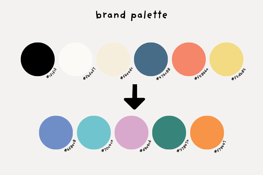
In envisioning the second prototype, this was the colour scheme and logo used:
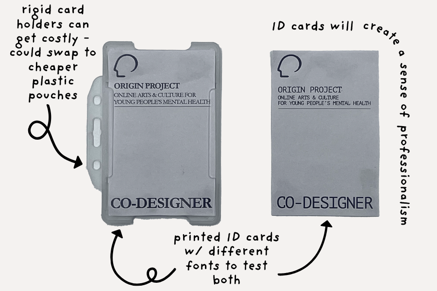
With a brand identity, the mock-ups of the ID cards were straightforward. It needed the project logo and description so that Co-Designers can present themselves as part of a proper organisation when they went to museums and archive spaces, officialising their presence. It might bolster their confidence of the process as well.
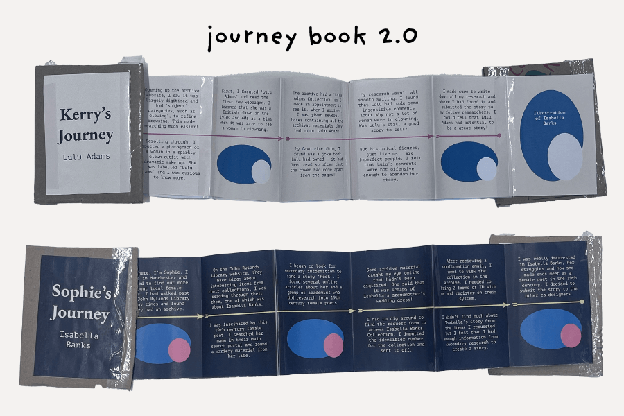
Having agreed that the accordion-style fold on the Journey Book was an efficient way of presenting the sequential narration of finding stories, the second version of it developed on the written content as well as visual design. Next steps were to refine the physicality of it, which included the type of paper it’s printed on and adding illustrations on the placeholder graphic.
Perhaps the hardest element of all to produce were the Discussion Cards, since their dimensions had to be adjusted multiple times. Discussion cards are a stack of 28 cards containing the instructions to use as well as six categories of prompts:
Where do I start?
What do I look for?
I’ve found an object
How do I find a story?
I’ve found a story
Final Reflections
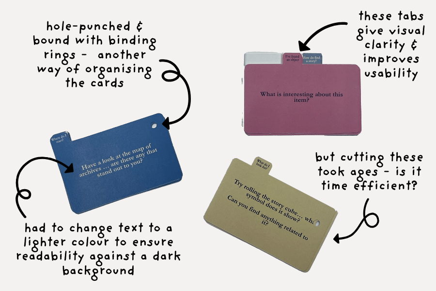
An initial thought was to have the cards printed like index cards with tabs dividing the categories, but this would prove to be both time and cost inefficient. As the printing, cutting and binding together of the resources were to be produced in-house, cutting the Discussion Cards with each individual tab would take time and accuracy to ensure a professional quality – having to produce 50 units of them wouldn’t be possible with the timeframe the research assistants were given. A tabulated design increases the cost of printing the discussion cards too. To work around these problems, the alternative of having the cards ranging in height by category was developed, bringing it in line with budget whilst not sacrificing ease of use of the design itself.
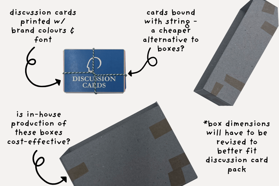
Another factor of designing the Discussion Cards were their packaging. As seen in prototype 2, a box was mocked up to fit in neatly with the rest of the components in the prototype kit box – but this was far too big for the Discussion Cards and the cost of producing this box was out of the budget as well, so alternatives were considered.
Following on from discussions with the other work packages, it was established that the Co-Design Kit should be consistent with the branding identity adopted during the first iteration of the Ways of Being platform; this meant small changes had to be made to the Co-Design Kit in terms of colour scheme and logo.
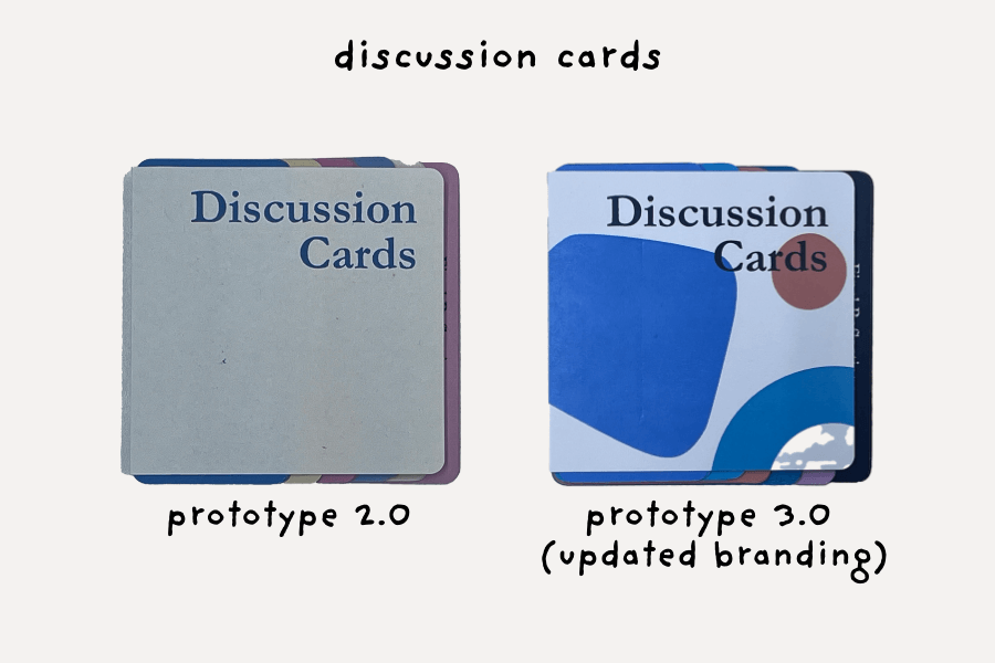
Rebranding took place over a few days and was a relatively quick process as only the logo and colours needed to be changed, not any of the content; with the majority remaining the same. Along with the change to the branding to the Discussion Cards, the assistants decided on a simple card slip with the title ‘Discussion Cards’ wrapped around the stack of cards fastened with a bulldog clip as the packaging – an economical and efficient choice.
Along with the change to the branding to the Discussion Cards, the assistants decided on a simple card slip with the title ‘Discussion Cards’ wrapped around the stack of cards fastened with a bulldog clip as the packaging – an economical and efficient choice.
Another component that had gone through big changes since its last iteration is the Journey Book. After the illustrations were added to the placeholder, the Journey Book was adjusted to a smaller size that the previous one so it is less unwieldy and fits the hand better. It was then printed and reinforced with the front covers printed on card, so that it had a bit of weight to it, and with the glossy feel of the material, the final product will reflect a luxurious and professional feel.
Other changes that can be seen in this latest prototype are the switch to a plastic sleeve badge holder rather than a rigid plastic badge holder to save cost (why the pencils were swapped out to the smaller ones as well), and the bright red Lab4Living lanyard was switched out for a black one to better fit the branding.
It was decided that the kit boxes would be outsourced as well, since the cost and time that would’ve went into designing, printing, cutting and putting together of custom boxes was out of the budget. A new addition to the kit was the ‘What’s in the Box?’ sheet, a contents page of sorts to help catalogue all the components with their purposes.
Design Considerations
Since the ideation stage, accessibility was a chief consideration. An accessible kit will enable a greater breadth and range of young people to interact with it and support the need for diverse story submissions.
In the updated brand design, high contrast colours were used to help all users distinguish between different elements and improve readability, specifically catered to users who struggle with colour blindness or low vision. Similar principles applied to the selection of the brand fonts EB Garamond and PT Mono, which are ornate enough to imply the old typewriter style the researchers had envisioned but are still legible enough to understand.
Another investment into ensuring the Co-Design Kits were accessible was by creating ‘personas’, or fictional characters that encapsulate the essence of the very real, diverse young people in the Co-Designers Network that were needed to locate hidden stories.
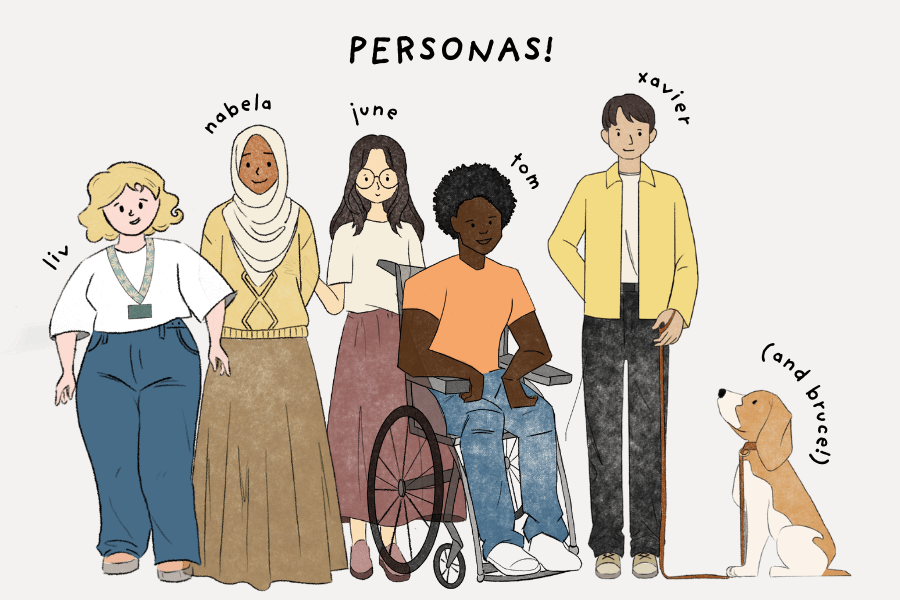
Above are the personas the research assistants created; this group of characters belong to LGBTQ+, ethnic minority, marginalised gender and disabled populations, as well as other marginalised populations that can’t necessarily be represented visually (working class, refugee status, in care, etc). Though the research assistants were aware they won’t be able to capture the entirety of the profile of the Co-Designers, they felt it was still necessary to try and capture as much as they possibly can.
It is hoped that these personas will create a sense of belonging to the Co-Designers Network, and not have the kit feel like a chore. In addition to these personas, the researchers included themselves throughout these kits as friendly faces that serve as a guide through the process.
Other than accessibility, the research assistants wanted to employ design as a tool to keep things interesting and engaging. In its essence, the Co-Design Kit deals with rather elaborate topics like archival research. Having different elements to examine and play around with will increase the chances of attracting and keeping attention, and this was achieved by exploring tactility and different printing styles.
Crafting the Story Dice out of thin plywood gives a unique sensory experience that invites the user to explore with it, as it is unlike common paper. But paper itself can offer various sensorial possibilities – printing on higher gsm paper gave a professional quality, as well as printing on card stock whenever it was deemed necessary.
Having the printed content presented in different ways not only ensured they were displayed effectively, but the variation in design was stimulating as well. Folded and tucked into an envelope (Welcome Letter), bound into books (User Guide & Field Guide), folded into an accordion (Journey Book) or grouped into stacks (Discussion Cards); the Co-Design Kit is built to be taken apart, studied and applied to archival research.
Next Steps
At this current stage, the co-design kits have been sent to the project’s cultural partners, including the Museum of Cornish Life and the Museum of Liverpool, as well as the ORIGIN Research Advisory Group (ORAG), a group of diverse 16-24 year olds informing the research with their lived experiences, to be reviewed. It is hoped that this initial round of feedback will improve the kit to better suit its purposes.